2 MDN tutorial: CSS first steps
2.1 What is CSS? - Learn web development
2.2 Getting started with CSS - Learn web development
3 MDN tutorial: CSS Building blocks
3.2 Cascade and inheritance (TBD)
WWN Development Document
Web-Page Structure :
CSS references and tutorials
Word’s Navigation pane shows the table-of-contents (View : Show : Navigation pane).
· Contents:
o CSS references and tutorials used in writing WWN’s CSS-file
This document was created by the WWN author for his own use in developing WWN. It is included in the WWN repo, as other developers may find it useful.
--------------
For the sections with tutorials, some of the notes are copied directly from the tutorials. The copyright for the tutorials is:
Portions of this content are ©1998–2023 by individual mozilla.org contributors. Content available under a Creative Commons license.
1 CSS References
1.1 CSS
· CSS reference - CSS: Cascading Style Sheets | MDN
o https://developer.mozilla.org/en-US/docs/Web/CSS/Reference
· HTML and CSS Tutorial: The Basics
o https://www3.ntu.edu.sg/home/ehchua/programming/webprogramming/HTML_CSS_Basics.html
1.2 jQuery
· jQuery
1.3 jQuery UI
· jQuery UI 1.9 Documentation
o https://api.jqueryui.com/1.9/
1.4 Tools
· All CSS linters - Mega-Linter
o https://nvuillam.github.io/mega-linter/descriptors/css/
2 MDN tutorial: CSS first steps
· CSS first steps - Learn web development | MDN
o https://developer.mozilla.org/en-US/docs/Learn/CSS/First_steps
2.1 What is CSS? - Learn web development
· What is CSS? - Learn web development | MDN
o https://developer.mozilla.org/en-US/docs/Learn/CSS/First_steps/What_is_CSS
· Browser support: each property page on MDN shows the which browsers support it
· Modules: the CSS language is broken down into modules
· CSS specifications: intended for engineers to implement browsers, not for web developers to read to understand CSS
· Stylesheet
· Basic elements of CSS rules
o The rule opens with a selector . This selects the HTML element that we are going to style. In this case we are styling level one headings (<h1>).
o We then have a set of curly braces { }. Inside those will be one or more declarations, which take the form of property and value pairs.
h1 {
color: red;
font-size: 5em;
}
2.2 Getting started with CSS - Learn web development
· Getting started with CSS - Learn web development | MDN
o https://developer.mozilla.org/en-US/docs/Learn/CSS/First_steps/Getting_started
· To link styles.css to index.html add the following line somewhere inside the <head> of the HTML document:
o <link rel="stylesheet" href="styles.css">
· element selector — this is a selector that directly matches an HTML element name
p, li {
color: green;
}
· Classes:
.special {
color: orange;
font-weight: bold;
}
-
<li class="special">Item two</li>
o "target any li element that has a class of special..."
li.special,
span.special {
color: orange;
font-weight: bold;
}
· class for a specific html tag:
p.myp {
color: green;
}
<p class="myp">test</p>
· NOTE: IDs
o In CSS:
#intro { color: red }
o In HTML:
§ html - What's the difference between an id and a class? - Stack Overflow
· https://stackoverflow.com/questions/544010/whats-the-difference-between-an-id-and-a-class
An id must be unique in the whole page.
A class may apply to many elements.
Sometimes, it's a good idea to use ids.
In a page, you usually have one footer, one header...
Then the footer may be into a div with an id
<div id="footer" class="...">
and still have a class
· a selector called the descendant combinator
o This selector will select any <em> element that is inside (a descendant of) an <li>
li em {
color: rebeccapurple;
}
· adjacent sibling combinator
o styling a paragraph when it comes directly after a heading at the same hierarchy level in the HTML.
§ To do so place a + (an adjacent sibling combinator) between the selectors.
h1 + p {
font-size: 200%;
}
· <span>
o The HTML <span> element is a generic inline container for phrasing content, which does not inherently represent anything. It can be used to group elements for styling purposes (using the class or id attributes), or because they share attribute values, such as lang. It should be used only when no other semantic element is appropriate. <span> is very much like a <div> element, but <div> is a block-level element whereas a <span> is an inline element.
<span class="special">text</span>
· Styling things based on state
o When we style a link we need to target the <a> (anchor) element. This has different states depending on whether it is unvisited, visited,...
o You can use CSS to target these different states
a:visited {
color: green;
}
· you can combine multiple selectors and combinators together.
/* selects any <span> that is inside a <p>, which is inside an <article> */
article p span { ... }
/* selects any <p> that comes directly after a <ul>, which comes directly after an <h1> */
h1 + ul + p { ... }
· You can combine multiple types together, too.
o This will style any element with a class of special, which is inside a <p>, which comes just after an <h1>, which is inside a <body>
body h1 + p .special {
color: yellow;
background-color: black;
padding: 5px;
}
2.3 How CSS is structured
· How CSS is structured - Learn web development | MDN
o https://developer.mozilla.org/en-US/docs/Learn/CSS/First_steps/How_CSS_is_structured
· three methods of applying CSS to a document: with an external stylesheet, with an internal stylesheet, and with inline styles.
· NOTE: MS Word's internal style sheet, within an HTML comment
o HTML comment tags are ignored by CSS
§ https://stackoverflow.com/questions/9812489/html-comments-in-css
· internal stylesheets
o can be useful. For example, perhaps you're working with a content management system where you are blocked from modifying external CSS files.
o But for sites with more than one page, an internal stylesheet becomes a less efficient way of working
· Inline styles
o Inline styles are CSS declarations that affect a single HTML element, contained within a style attribute.
o Avoid using CSS in this way, when possible. It is the opposite of a best practice.
<p style="color:red;">This is my first CSS example</p>
· Selectors
o If CSS is not applying to content as expected, your selector may not match the way you think it should match.
· The universal selector (*) selects all HTML elements on the page.
o The CSS rule below will affect every HTML element on the page:
* {
text-align: center;
color: blue;
}
· CSS Selectors
o https://www.w3schools.com/css/css_selectors.asp

· CSS Selectors Tutorial | HTML & CSS Is Hard
o https://www.internetingishard.com/html-and-css/css-selectors/
· cascade and specificity
o The CSS language has rules to control which selector is stronger in the event of a conflict.
§ These rules are called cascade and specificity.
o cascade rule: Later styles replace conflicting styles that appear earlier in the stylesheet.
o specificity: However, in the case of our earlier example with the conflict between the class selector and the element selector, the class prevails, rendering the paragraph text red. How can this happen even though a conflicting style appears later in the stylesheet? A class is rated as being more specific, as in having more specificity than the element selector, so it cancels the other conflicting style declaration.
· Properties and values
o At its most basic level, CSS consists of two components:
o Properties: These are human-readable identifiers that indicate which stylistic features you want to modify. For example, font-size, width, background-color.
o Values: Each property is assigned a value. This value indicates how to style the property.

· If a property is unknown, or if a value is not valid for a given property, the declaration is processed as invalid. It is completely ignored by the browser's CSS engine.
· Functions
o While most values are relatively simple keywords or numeric values, there are some values that take the form of a function. An example would be the calc() function, which can do simple math within CSS:
.box {
padding: 10px;
width: calc(90% - 30px);
background-color: rebeccapurple;
color: white;
}
· @rules
o CSS @rules (pronounced "at-rules") provide instruction for what CSS should perform or how it should behave.
o Some @rules are simple with just a keyword and a value. For example, @import imports a stylesheet into another CSS stylesheet:
@import 'styles2.css';
o One common @rule that you are likely to encounter is @media, which is used to create media queries. Media queries use conditional logic for applying CSS styling.
o In the example below, the stylesheet defines a default pink background for the <body> element. However, a media query follows that defines a blue background if the browser viewport is wider than 30em.
body {
background-color: pink;
}
@media (min-width: 30em) {
body {
background-color: blue;
}
}
· Shorthands
o Some properties like font, background, padding, border, and margin are called shorthand properties. This is because shorthand properties set several values in a single line.
/* In 4-value shorthands like padding and margin, the values are applied
in the order top, right, bottom, left (clockwise from the top). There are also other
shorthand types, for example 2-value shorthands, which set padding/margin
for top/bottom, then left/right */
padding: 10px 15px 15px 5px;
o is equivalent to these four lines of code:
padding-top: 10px;
padding-right: 15px;
padding-bottom: 15px;
padding-left: 5px;
o Warning: One less obvious aspect of using CSS shorthand is how omitted values reset. A value not specified in CSS shorthand reverts to its initial value. This means an omission in CSS shorthand can override previously set values.
· CSS comments begin with /* and end with */.
2.4 How CSS works
· How CSS works - Learn web development | MDN
o https://developer.mozilla.org/en-US/docs/Learn/CSS/First_steps/How_CSS_works
· How does CSS actually work?
o The browser loads the HTML (e.g. receives it from the network).
o It converts the HTML into a DOM (Document Object Model). The DOM represents the document in the computer's memory. The DOM is explained in a bit more detail in the next section.
o The browser then fetches most of the resources that are linked to by the HTML document, such as embedded images and videos ... and linked CSS! JavaScript is handled a bit later on in the process, and we won't talk about it here to keep things simpler.
o The browser parses the fetched CSS, and sorts the different rules by their selector types into different "buckets", e.g. element, class, ID, and so on. Based on the selectors it finds, it works out which rules should be applied to which nodes in the DOM, and attaches style to them as required (this intermediate step is called a render tree).
o The render tree is laid out in the structure it should appear in after the rules have been applied to it.
o The visual display of the page is shown on the screen (this stage is called painting).
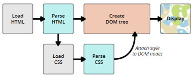
· About the DOM
o A DOM has a tree-like structure. Each element, attribute, and piece of text in the markup language becomes a DOM node in the tree structure. The nodes are defined by their relationship to other DOM nodes. Some elements are parents of child nodes, and child nodes have siblings.
· A real DOM representation
o NOTE: see web-page
· What happens if a browser encounters CSS it doesn't understand?
o browsers do not all implement new CSS at the same time. In addition, many people are not using the latest version of a browser. Given that CSS is being developed all the time, and is therefore ahead of what browsers can recognize, you might wonder what happens if a browser encounters a CSS selector or declaration it doesn't recognize.
o The answer is that it does nothing, and just moves on to the next bit of CSS!
· Coupled with the way that the cascade works, and the fact that browsers will use the last CSS they come across in a stylesheet when you have two rules with the same specificity you can also offer alternatives for browsers that don't support new CSS.
.box {
width: 500px;
width: calc(100% - 50px);
}
2.5 Using your new knowledge
· Using your new knowledge - Learn web development | MDN
o https://developer.mozilla.org/en-US/docs/Learn/CSS/First_steps/Using_your_new_knowledge
· Kent C. Dodds
o https://kentcdodds.com/courses/
· The border-bottom property is a shorthand for the following CSS properties:
o border-bottom-color
o border-bottom-style
o border-bottom-width
· Give the heading a 10px dotted border-bottom which uses the CSS color keyword purple.
o
· Padding creates extra space within an element. In contrast, margin creates extra space around an element.
o padding - CSS: Cascading Style Sheets | MDN
§ https://developer.mozilla.org/en-US/docs/Web/CSS/padding
3 MDN tutorial: CSS Building blocks
· CSS building blocks - Learn web development | MDN
o https://developer.mozilla.org/en-US/docs/Learn/CSS/Building_blocks
3.1 Intro
· CSS building blocks - Learn web development | MDN
o https://developer.mozilla.org/en-US/docs/Learn/CSS/Building_blocks
3.2 Cascade and inheritance (TBD)
· Cascade and inheritance
o https://developer.mozilla.org/en-US/docs/Learn/CSS/Building_blocks/Cascade_and_inheritance
o NOTE: looks useful
3.3 CSS selectors (TBD)
· CSS selectors - Learn web development | MDN
o https://developer.mozilla.org/en-US/docs/Learn/CSS/Building_blocks/Selectors
3.4 The box model
· The box model - Learn web development | MDN
o https://developer.mozilla.org/en-US/docs/Learn/CSS/Building_blocks/The_box_model
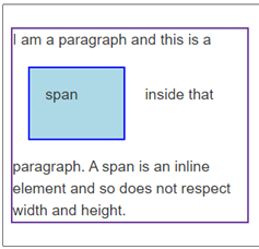
· Block and inline boxes
o In CSS we broadly have two types of boxes — block boxes and inline boxes.
· If a box is defined as a block, it will behave in the following ways:
o The box will break onto a new line.
o The box will extend in the inline direction to fill the space available in its container. In most cases this means that the box will become as wide as its container, filling up 100% of the space available.
o The width and height properties are respected.
o Padding, margin and border will cause other elements to be pushed away from the box
· If a box has an outer display type of inline, then:
o The box will not break onto a new line.
o The width and height properties will not apply.
o Vertical padding, margins, and borders will apply but will not cause other inline boxes to move away from the box.
o Horizontal padding, margins, and borders will apply and will cause other inline boxes to move away from the box.
· The type of box applied to an element is defined by display property values such as block and inline, and relates to the outer value of display.
· Aside: Inner and outer display types
o boxes in CSS have an outer display type, which details whether the box is block or inline.
o Boxes also have an inner display type, however, which dictates how elements inside that box are laid out.
o By default, the elements inside a box are laid out in normal flow, which means that they behave just like any other block and inline elements (as explained above).
o We can, however, change the inner display type by using display values like flex. If we set display: flex; on an element, the outer display type is block, but the inner display type is changed to flex. Any direct children of this box will become flex items and will be laid out according to the rules set out in the Flexbox spec, which you'll learn about later on.
· read more about the values of display, and how boxes work in block and inline layout, take a look at the MDN guide to Block and Inline Layout.
o Block and inline layout in normal flow
· What is the CSS box model?
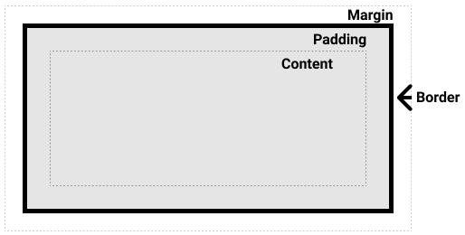
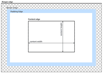
· Parts of a box
o Making up a block box in CSS we have the:
o Content box: The area where your content is displayed, which can be sized using properties like width and height.
o Padding box: The padding sits around the content as white space; its size can be controlled using padding and related properties.
o Border box: The border box wraps the content and any padding. Its size and style can be controlled using border and related properties.
o Margin box: The margin is the outermost layer, wrapping the content, padding and border as whitespace between this box and other elements. Its size can be controlled using margin and related properties.
· If we assume that the box has the following CSS defining width, height, margin, border, and padding:
.box {
width: 350px;
height: 150px;
margin: 10px;
padding: 25px;
border: 5px solid black;
}
· The [width] taken up by our box using the standard box model will actually be 410px (350 + 25 + 25 + 5 + 5), and the height 210px (150 + 25 + 25 + 5 + 5), as the padding and border are added to the width used for the content box.

· The alternative CSS box model
o Using this model, any width is the width of the visible box on the page
o By default, browsers use the standard box model. If you want to turn on the alternative model for an element you do so by setting box-sizing: border-box on it. By doing this you are telling the browser to take the border box as the area defined by any size you set.
.box {
box-sizing: border-box;
}
o If you want all of your elements to use the alternative box model, and this is a common choice among developers, set the box-sizing property on the <html> element, then set all other elements to inherit that value, as seen in the snippet below.
html {
box-sizing: border-box;
}
*, *::before, *::after {
box-sizing: inherit;
}
· Use browser DevTools to view the box model

· Margins, padding, and borders
o margin, padding, and border properties ...are shorthands and allow us to set all four sides of the box at once.
· Margin
o The margin is an invisible space around your box. It pushes other elements away from the box.
§ Margins can have positive or negative values.
§ Setting a negative margin on one side of your box can cause it to overlap other things on the page. Whether you are using the standard or alternative box model, the margin is always added after the size of the visible box has been calculated.
o We can control all margins of an element at once using the margin property, or each side individually using the equivalent longhand properties:
margin-top
margin-right
margin-bottom
margin-left
· Margin collapsing
o A key thing to understand about margins is the concept of margin collapsing. If you have two elements whose margins touch, and both margins are positive, those margins will combine to become one margin, which is the size of the largest individual margin. If one or both margins are negative, the amount of negative value will subtract from the total.

· Borders
o The border is drawn between the margin and the padding of a box.
o For styling borders, there are a large number of properties — there are four borders, and each border has a style, width and color that we might want to manipulate.

· Padding
o The padding sits between the border and the content area. Unlike margins you cannot have negative amounts of padding, so the value must be 0 or a positive value. Any background applied to your element will display behind the padding, and it is typically used to push the content away from the border.
o We can control the padding on each side of an element individually using the padding property, or each side individually using the equivalent longhand properties:
padding-top
padding-right
padding-bottom
padding-left
· The box model and inline boxes
o All of the above applies fully to block boxes. Some of the properties can apply to inline boxes too, such as those created by a <span> element.
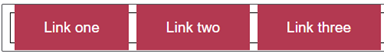
· Using display: inline-block
o There is a special value of display, which provides a middle ground between inline and block. This is useful for situations where you do not want an item to break onto a new line, but do want it to respect width and height and avoid the overlapping seen above.
· Add display: inline-block to the rule with the .links-list a selector, and you will see how it fixes this issue by causing the padding to be respected by other elements.
3.4.1 Introduction to the CSS basic box model
· Introduction to the CSS basic box model
o https://developer.mozilla.org/en-US/docs/Web/CSS/CSS_Box_Model/Introduction_to_the_CSS_box_model
· Every box is composed of four parts (or areas), defined by their respective edges: the content edge, padding edge, border edge, and margin edge.
3.4.2 Layout and the containing block
· Layout and the containing block
o https://developer.mozilla.org/en-US/docs/Web/CSS/Containing_block
· The size and position of an element are often impacted by its containing block. Most often, the containing block is the content area of an element's nearest block-level ancestor,
· When a user agent (such as your browser) lays out a document, it generates a box for every element. Each box is divided into four areas:

· Effects of the containing block
o The size and position of an element are often impacted by its containing block.
o Percentage values that are applied to the width, height, padding, margin, and offset properties of an absolutely positioned element (i.e., which has its position set to absolute or fixed) are computed from the element's containing block.
· Identifying the containing block
o The process for identifying the containing block depends entirely on the value of the element's position property:
o If the position property is static, relative, or sticky, the containing block is formed by the edge of the content box of the nearest ancestor element that is either a block container (such as an inline-block, block, or list-item element) or establishes a formatting context (such as a table container, flex container, grid container, or the block container itself).
o If the position property is absolute, the containing block is formed by the edge of the padding box of the nearest ancestor element that has a position value other than static (fixed, absolute, relative, or sticky).
o If the position property is fixed, the containing block is established by the viewport (in the case of continuous media) or the page area (in the case of paged media).
o If the position property is absolute or fixed, the containing block may also be formed by the edge of the padding box of the nearest ancestor element that has the following:
§ A transform or perspective value other than none
§ A will-change value of transform or perspective
§ A filter value other than none or a will-change value of filter (only works on Firefox).
§ A contain value of paint (e.g. contain: paint;)
· The containing block in which the root element (<html>) resides is a rectangle called the initial containing block. It has the dimensions of the viewport (for continuous media) or the page area (for paged media).
· Calculating percentage values from the containing block
o As noted above, when certain properties are given a percentage value, the computed value depends on the element's containing block. The properties that work this way are box model properties and offset properties:
§ The height, top, and bottom properties compute percentage values from the height of the containing block.
§ The width, left, right, padding, and margin properties compute percentage values from the width of the containing block.